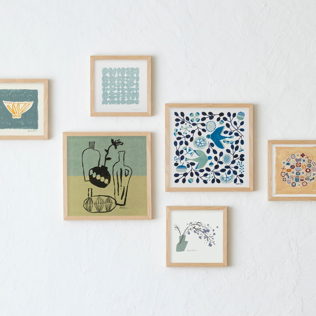
I often get asked, "Why are they all square?"
Certainly, when it comes to general art posters, rectangular formats such as A1 (594mm x 841mm), B2 (515mm x 728mm), and A2 (420mm x 594mm) are the mainstream. In fact, many canvases and papers have traditionally been rectangular, and many of the works called masterpieces have been painted in that format.
This stems from the fact that subjects such as people and landscapes tend to fit well within a rectangle. For landscape paintings, a horizontal format creates a sense of expanse, while for portraits, a vertical format results in a stable composition. It was natural for artists to choose rectangles according to the object they were expressing.
In light of all this, why are we so insistent on sticking to the square shape?
This time, I'd like to talk about the reason for that, in a slightly more serious way.
The square shape is actually very Japanese.
While paper culture itself is fundamentally based on rectangles, squares have naturally found their way into many aspects of Japanese culture. For example, furoshiki (wrapping cloth), origami, handkerchiefs, tatami mat arrangements, and the four-and-a-half-tatami-mat tea room (*1).
These squares are not only functional, but are also deeply connected to the Japanese aesthetic sense of "balance" and "negative space" *2. The feeling of finding tranquility and order within a square may be part of a sensibility that has been cultivated in everyday life.
From here on, I will introduce the charm that the square shape itself possesses.
Balanced beauty.
Because all sides and angles of a square are equal, it is an extremely symmetrical and balanced shape. It gives viewers a sense of security and stability, and brings a gentle harmony to the space *3.
Compact and easy to fit into any space.
Compared to rectangles, squares are easier to fit in the center or corners of a wall, and don't require a specific space to be displayed. Even in a limited space, they blend in seamlessly without feeling cramped.
Modern and sophisticated impression.
The square is one of the most perfect geometric shapes. Its simplicity makes it well-suited to modern spaces and minimalist interiors. It doesn't dominate, yet possesses a distinct presence. ※4
You can do whatever you want, depending on the combination.
Squares offer a wide variety of arrangement options, including vertical, horizontal, and grid patterns. Even when multiple squares are arranged together, the composition is less likely to fall apart, and they can be combined to create both horizontal and vertical displays. The fact that even works with different colors and motifs can create a unified display if the shapes are consistent is another attractive feature.
Depending on how you decorate it, it can have any expression.
I myself display various works at home, including vertical, horizontal, and square pieces, but I find it particularly interesting that squares can be arranged in multiple ways to freely change the overall impression.
A single piece creates a quiet presence. Arranging two or more pieces allows you to create a sense of flow and spaciousness in the room. It adapts naturally to any space, while respecting the sensibilities and lifestyle of the person who displays it. Isn't that the greatest charm of a square shape?
Sources and References
*1: Kenzo Fujii, "Furoshiki Culture and the Japanese People" (Tankosha, 2008)
*2: Masatake Matsuoka, "The Japanese Way - Forms of Thinking" (Chikuma Gakugei Bunko, 2006)
*3: Alex W. White, "The Elements of Graphic Design" (Allworth Press, 2011)
*4: Same as above


